How to Make Your Websites Trending and Mobile Friendly

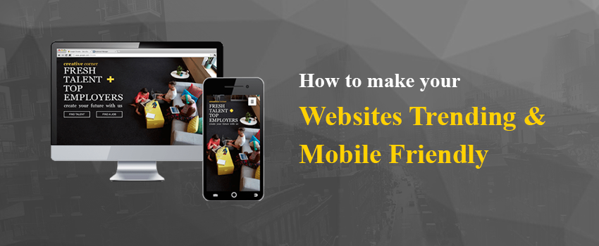
A website is the most essential online business tool and these days there are more mobile users. A mobile device is handy and it’s easy to access any online portal on the go. Its now so easy to find services and products on mobile devices therefore you must keep in mind that whether you website is accessible over the smartphone or not. This is where mobile friendliness comes in the scene. It depends on the kind of business, the customers and their unique requirements. Getting a new up-to-date website or redesigning won’t cost a fortune but if you are not taking a step forward, you are losing business.
Mobile website
An inexpensive way to convert your website into a mobile one is to create another version that is mobile optimized. Reputed Website Designing and Development services in Bangalore ensure that all the website features and content would load correctly while offer the right kind of user experience. Web designing firms have experts and also use various affordable tools to turn your website mobile friendly.
Responsive website
Think responsive, it’s the present trend. A responsive web design can be a very affordable way making your website mobile friendly. You might not opt for creating two separate websites; a single responsive web page can be the solution. This is now a very popular choice for companies with limited resources and within a budget. The development and maintenance charges can be invested in just a single website.
Mobile application
If you don’t opt for a mobile website, opt for a task-specific mobile application. This is what many companies do when they are looking for an affordable solution. But one thing that you must know is that mobile apps are more expensive than a mobile website.
Hybrid Solution
Are you aware of hybrid mobile solution? It is inclusive mobile website module and a mobile app element. Any organization that selects this module aims at offering customers privilege while using a mobile app. Any other task than the specific ones, the visitor needs to visit company profile.
A few elements will never downsize
Experienced Web Design and Development in Bangalore are aware of not using sliders or carousels in the design or else it would break on small screens. The navigation structure should be very simple so that the site is easy to navigate on small screen and with fingers. It’s wise not to bury essential content under various layers of buttons and menus or other elements.
Remove auto-zoom
Auto-zoom can basically mess up the layout, mainly the navigation and images. They might too large or very small. The remedy is to use View-port Meta tag so that you can design custom variables inside the content. Designers must include the tag in HTML.
Testing
While the design phase, prior to the launch, test the front page of the website and other important pages. The companies have a team of efficient testers to ensure the navigation and graphical elements are perfect. They check the website on iPhone and Android prior to the launch. Its good to use as many videos on the website and this makes viewing on mobile devices a great experience. Web designing companies also make sure that the fonts are easily readable on mobile devices.


